Competetive Smash
Around one and a half year ago i started playing Super Smash Bros. Melee. A game series i've played casually from time to time, until i realized there was competetive scene. Super Smash Bros is platform fighting game series featuring Nintendo characters battling each other in a king of the hill type of style. Now 15 years later and the competitive scene for Super Smash Bros Melee is still alive and i've become part of my local scene. Because of my passion for the game and community i've become responsible as a designer and TO in my community. So i've done some design work our organisation Smash Rogaland.
The Logo

When i joined the local scene i wasn't too happy with the current designs, so i came with some suggestions for visual improvements. The logo that was being used was good, but had poor craftmanship. The logo is a combination of the official smash logo by Nintendo and the shield symbol for the region "Rogaland" in Norway. It's a visual representation of "Smash Rogaland" which is the name our our organisation. The logo and symbol have a great recognition factor, so the combination of the two creates a powerfull logo. I didn't need to fix a lot, but i gave the logo the proper region symbol color, aligned the smash symbol with the original one and made it more crispy overall. Since i made it with vectors in illustrator we can change the size to anything now.
Brand Identity

Smash as a game series also has a very busy visual identity since it's a clash of different characters with different colors and themes. I thought simple colors such as skye blue, blue and white is a good idea then. So that the design attract attention from the visuals of the game.
Facebook Page
I also designed a facebook page for our organisation. One problem i have with facebook is that already has it's own color scheme, but the color scheme was already skyblue/blue it didn't turn into a visual mess. As for the banner i used recognizeable silhouttes from the Smash series, to avoid visual mess of colors. Again i like things simple and clean.

Core Identity
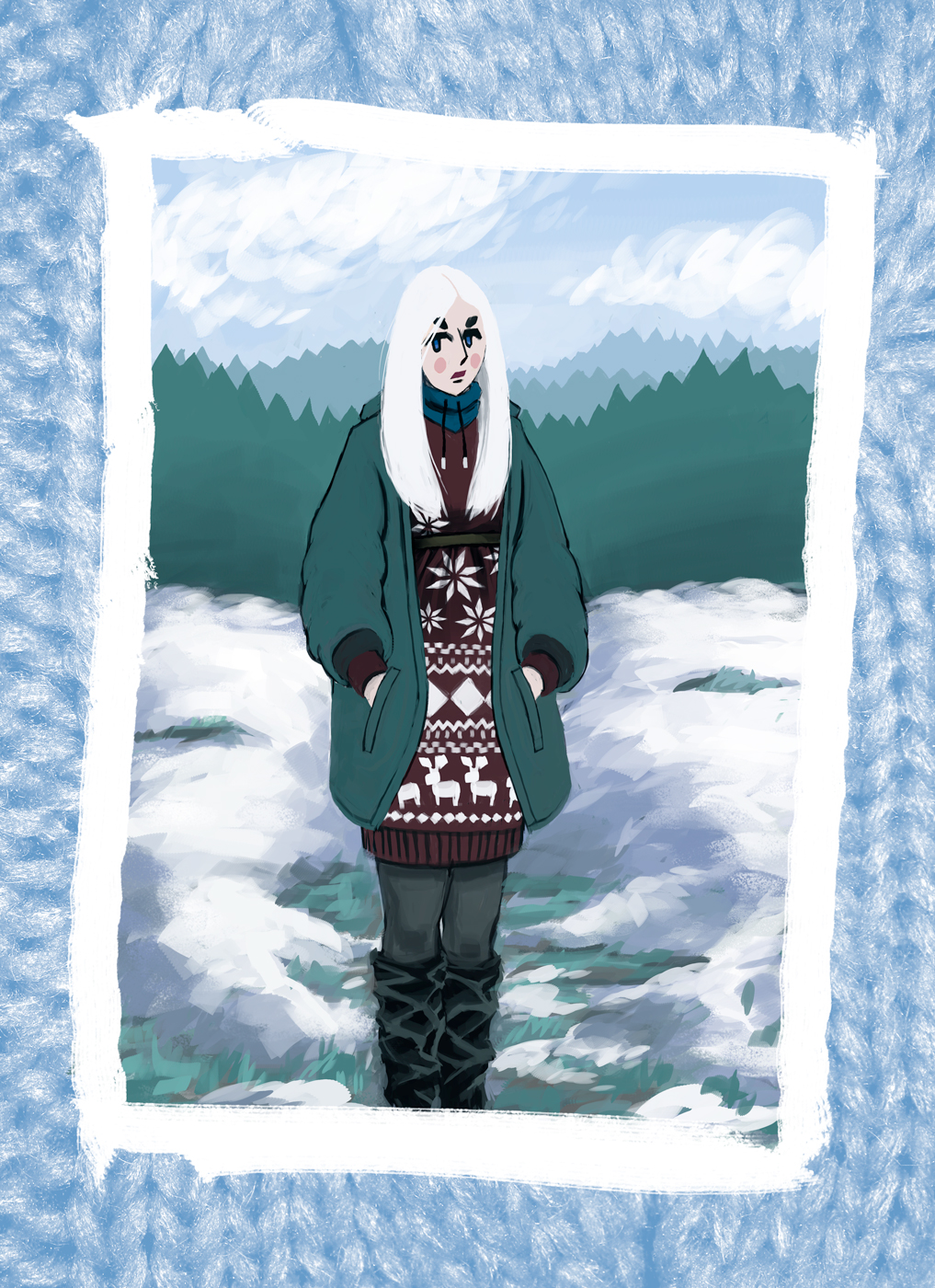
I wasn't fully certain how i wanted the banner to be like. I considered having people from our local scene represented instead of having the game characters on. It's like a question of what the scene is all about "the game or the players". In truth it's both, but it's difficult to combine the two visually. I valued game over players in this case. The bottom tells a much better story though and is easier to relate to.
The game?

or
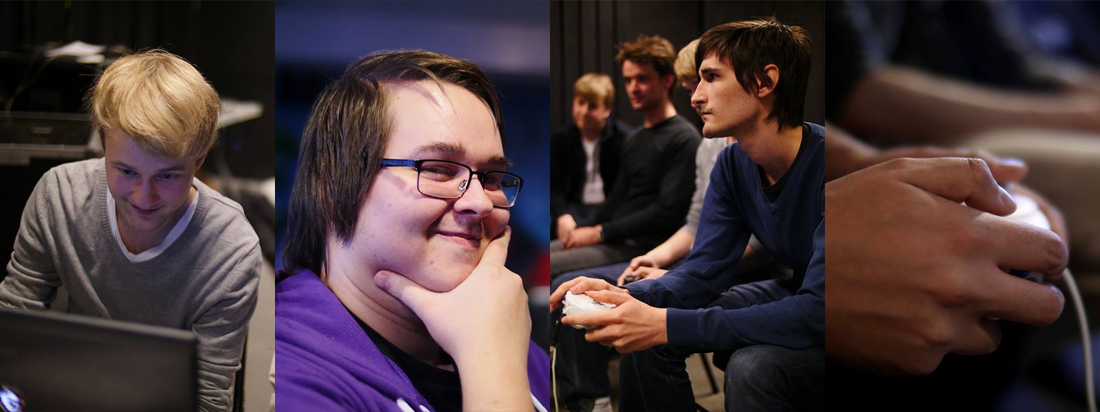
The players?
Stream

Stream overlay for Melee gameplay.

Stream overlay for Smash 4 gameplay.

Stream scene used for breaks before stream, between sets, games and after stream.

Stream scene to show both player cameras immediately before a set starts.
I also made a design for our streaming channels on twitch: https://www.twitch.tv/smashrogaland and https://www.twitch.tv/smashrogaland2. I took most of my inspiration from Genesis 4, Beast 7 and Eclipse 3 as they had a minimalistic style that i liked. I think that what makes a stream design good is having an overlay that compliments what game that's currently on the stream and so it shouldn't detract focus from the gameplay. Which is why i think minimalistic approach is good, with no excessive information or attention seeking visuals. The idea of having moving animations tickled my fancy, but i think they were slightly distracting if they moved too fast or had significant details.
Poster

Facebook banner(s)


I also tried to keep the facebook event visually consistent with the poster, but it didn't look very nice so i had i decided to change it. I was kind of stressed out since i was also the person organising the event. We had about 60 entrants and around 80 visitors that day, so i'm happy it turned out great. The stream didn't go so well since we have nobody to run. Even though we doublechecked that everything worked with the stream a few days earlier, shit always happens to the technical stuff.
Subsequent tournaments

Moving forward from our "big smash event" i decided to standardize the event banner for our future tournaments. So that the smaller tournaments that we run every friday are called "RogaSmash #Number" and have the samme event image every time. While calling the greater tournaments "MetroSmash" as a homage to the local that we use and people who support us with prizes. To help differentiate between locals and regionals.

These banners were designed to both work in the cropped version as well as when you search for events in search tab on facebook.
So this is all the work that i've done for my scene. I got a bit exhausted from both organising and designing during the big tournament event. The scene is back to lowkey friday tournaments again until i decide it's time that we want another big event.